

Content to concept
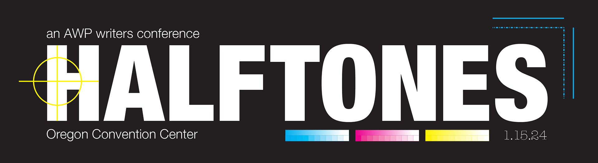
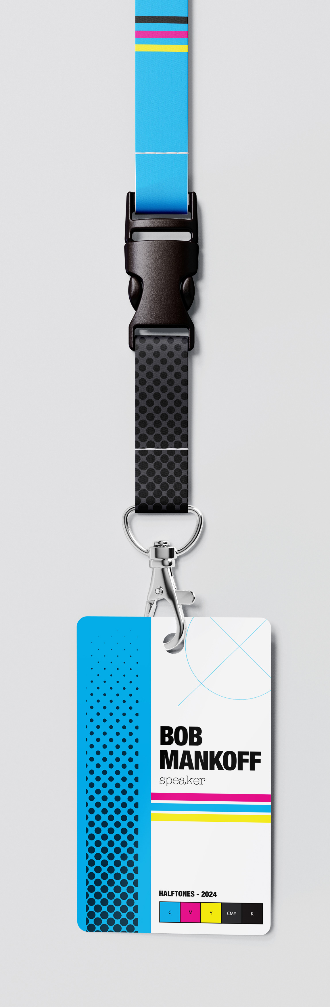
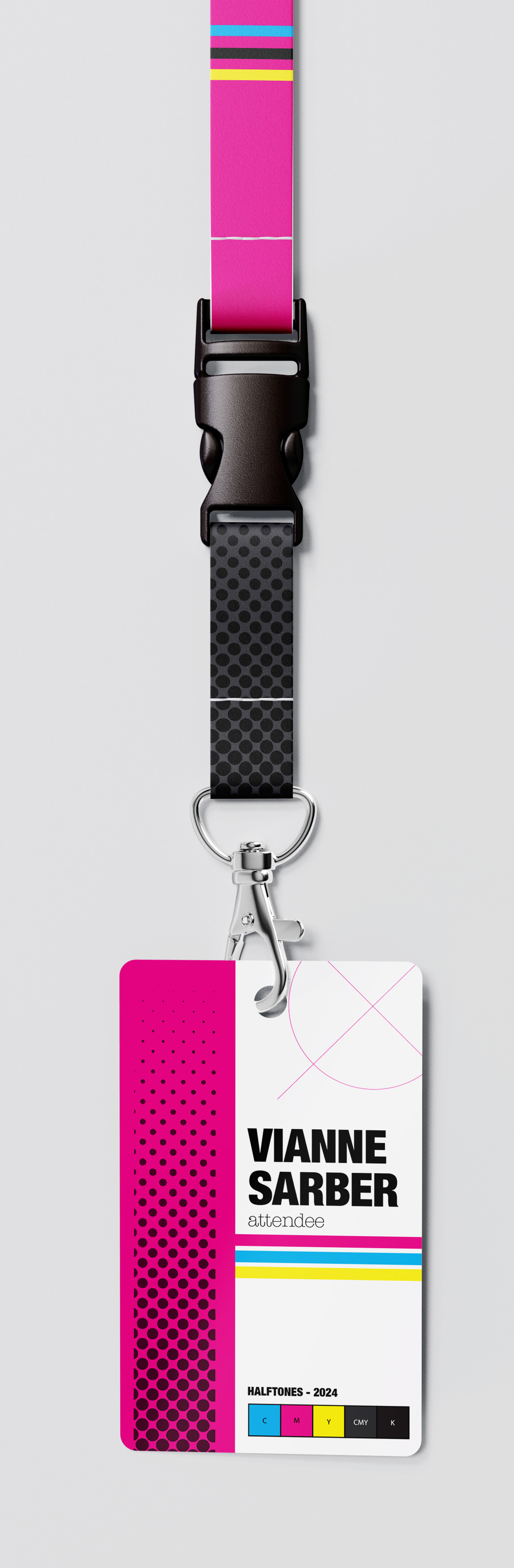
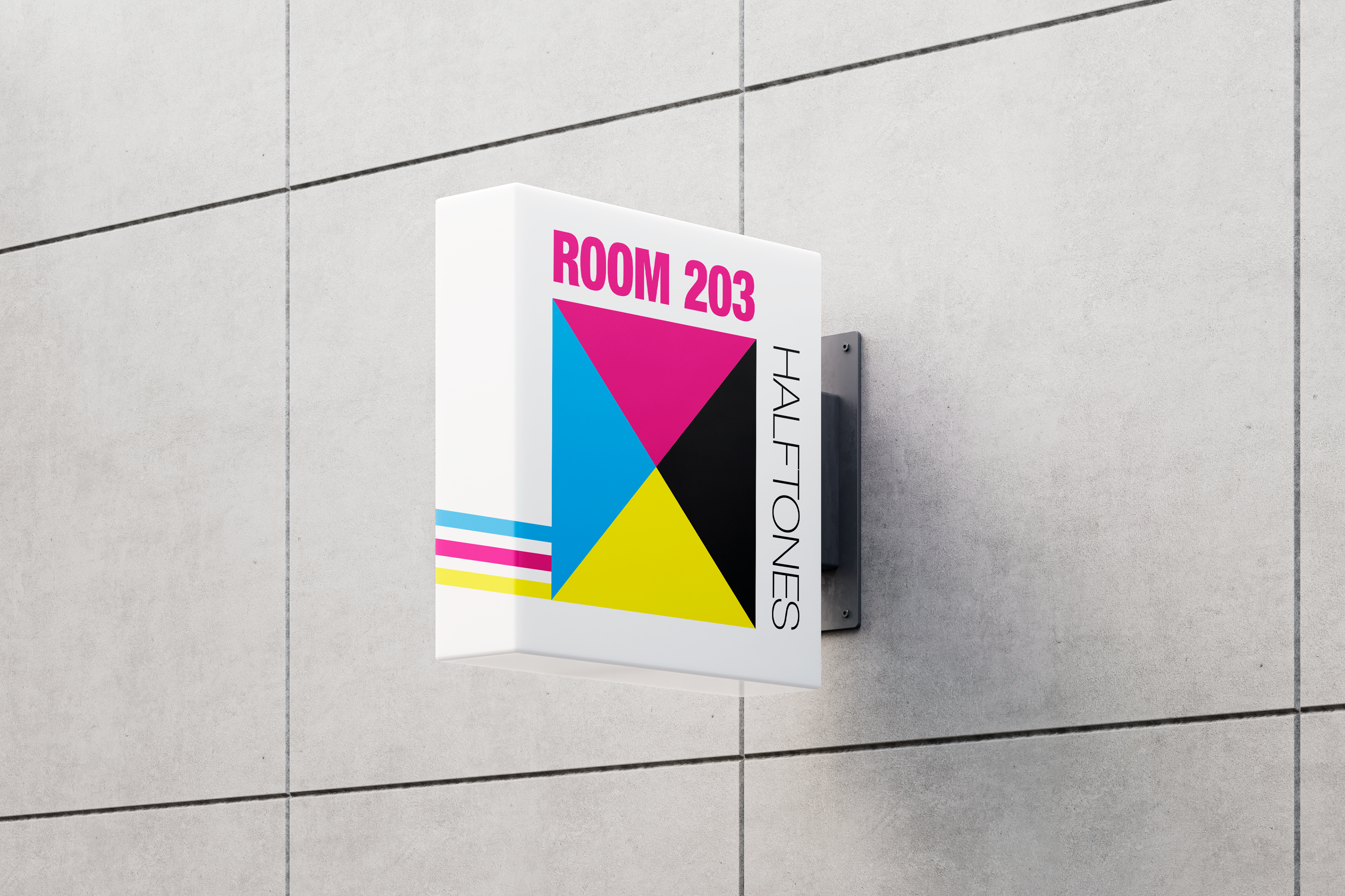
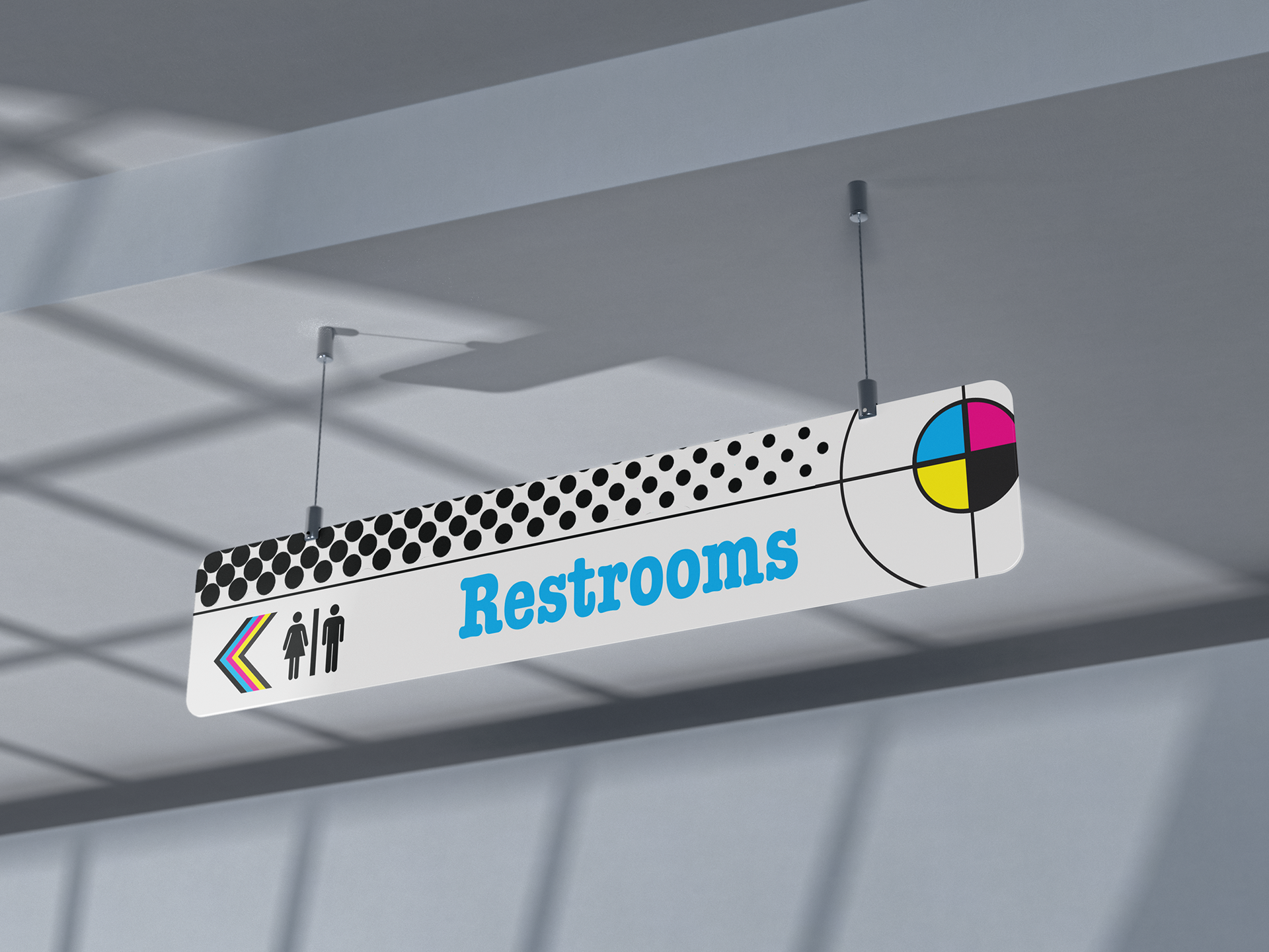
In HALFTONE’s event branding, the typographic structure is geometric, simple, but not clinical or cold. It keeps a vivid and exciting tone while maintaining professional. The combination of professional text with bright colors was the perfect example the publishing industry; It’s bright, engaging, and active. There are fast turnarounds and deadlines, and never a dull moment.

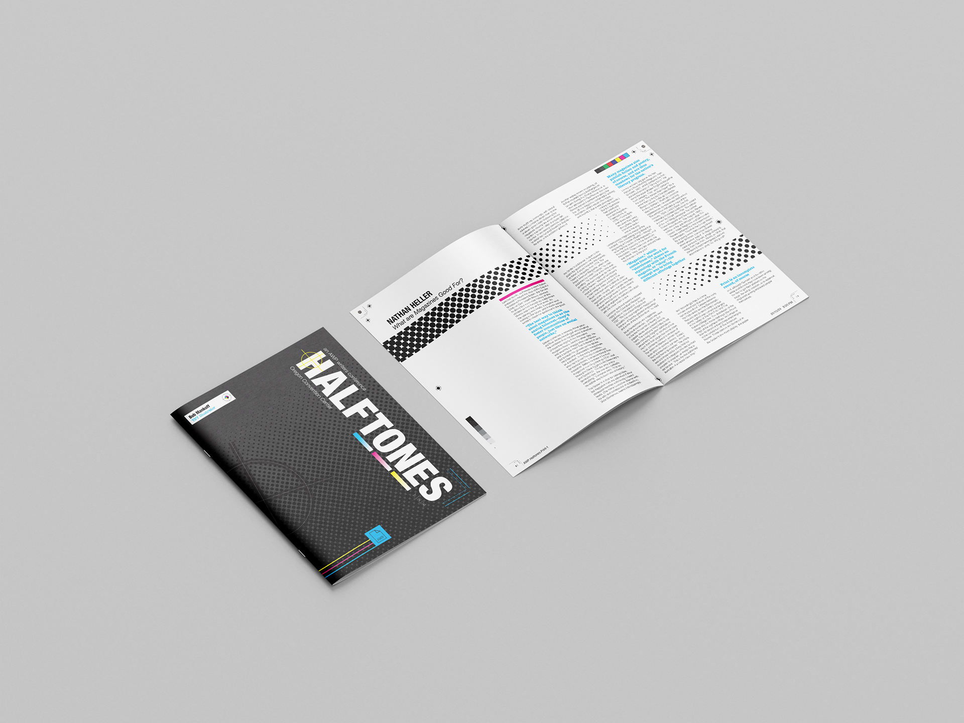
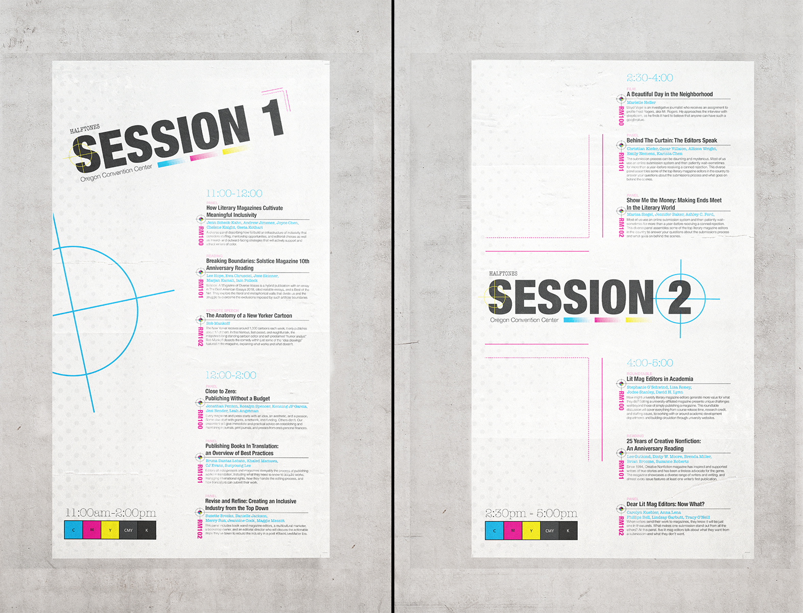
Project phases include: concept development, branding elements and guidelines, key messaging, and collateral development through to final print/production-ready pieces. Key objectives are to develop a system that not only fits, but celebrates the conference concept and successfully communicates that theme and conference information to the audience in a way that is clear and engaging.
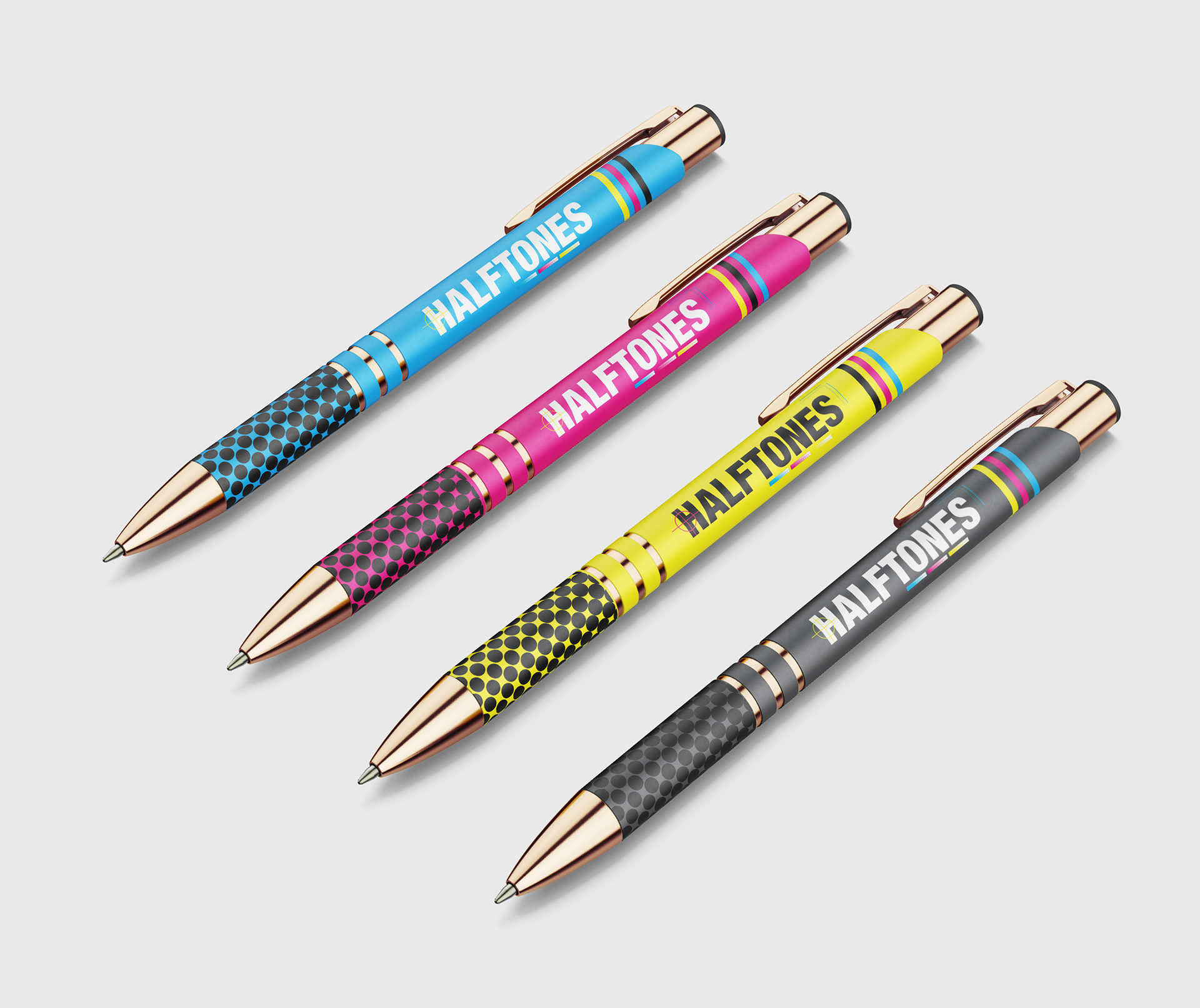
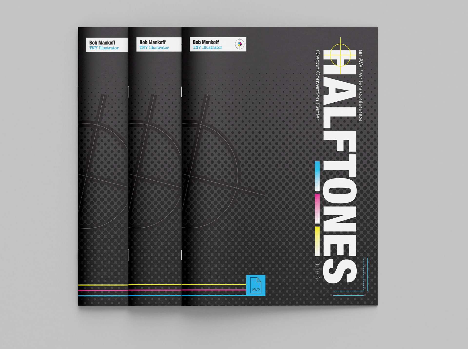
Color Significance
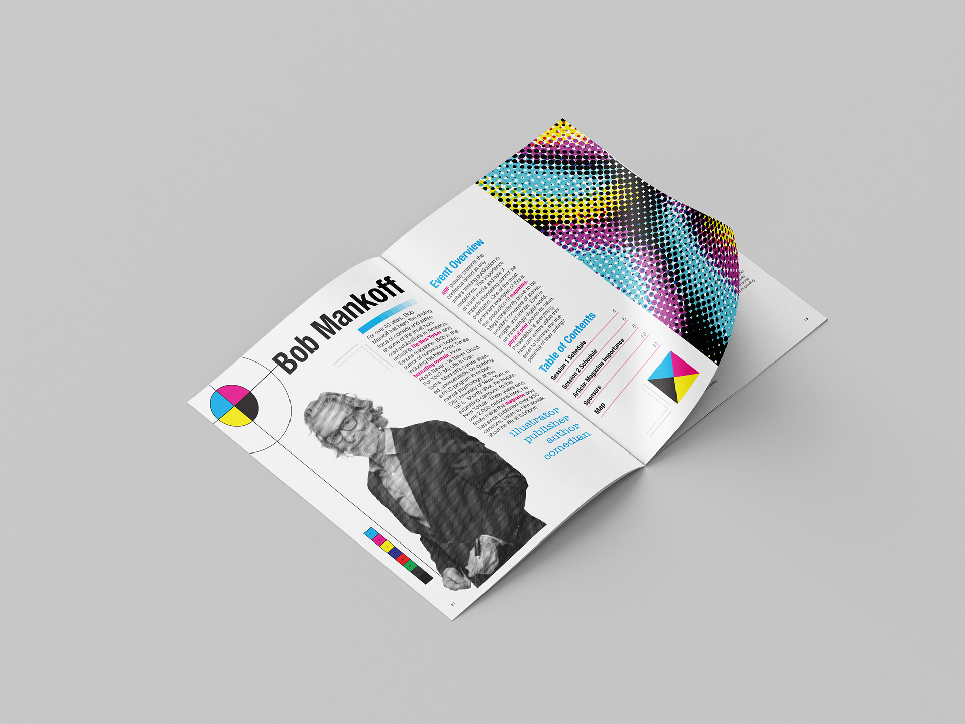
CMYK colors are the backbone of the design, as well as the dotted halftone graphic method of printing. It is the ideal blend of old and new, modern and traditional printing techniques. A modern conference for a timeless art form - be it writer, illustrator, or artist.
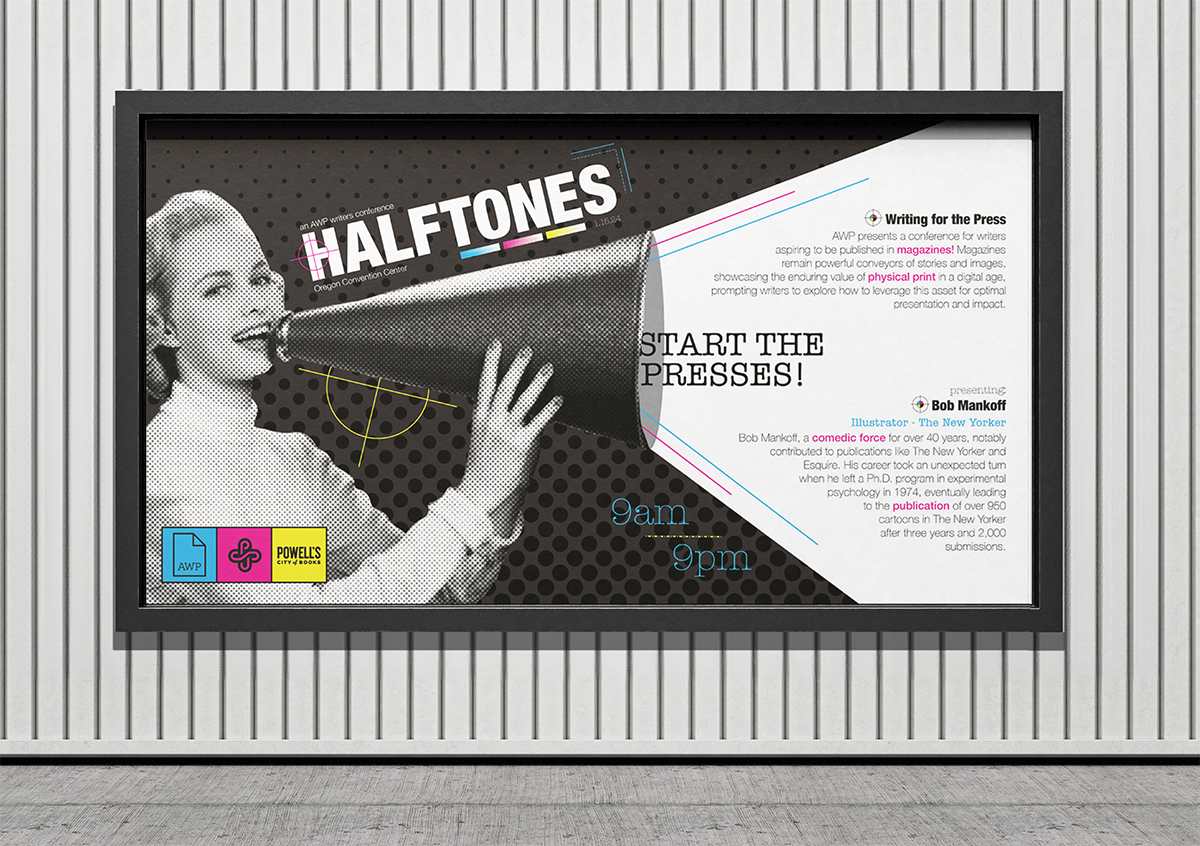

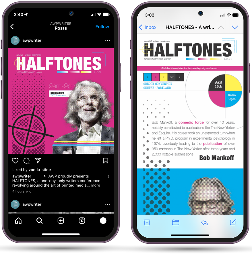
For such a major event, seamless advertising and information distribution were key. From email newsletters to Instagram posts, every print magazine enthusiast needed to know about this exciting conference and speaker.
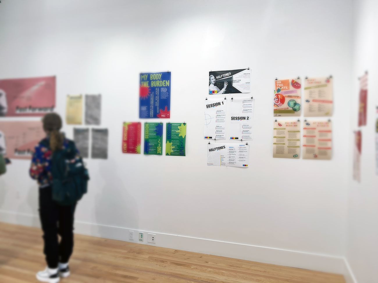
My typographic work for HALFTONES was selected to be showcased in a curated student exhibition of Fairbanks Gallery in Corvallis, OR.