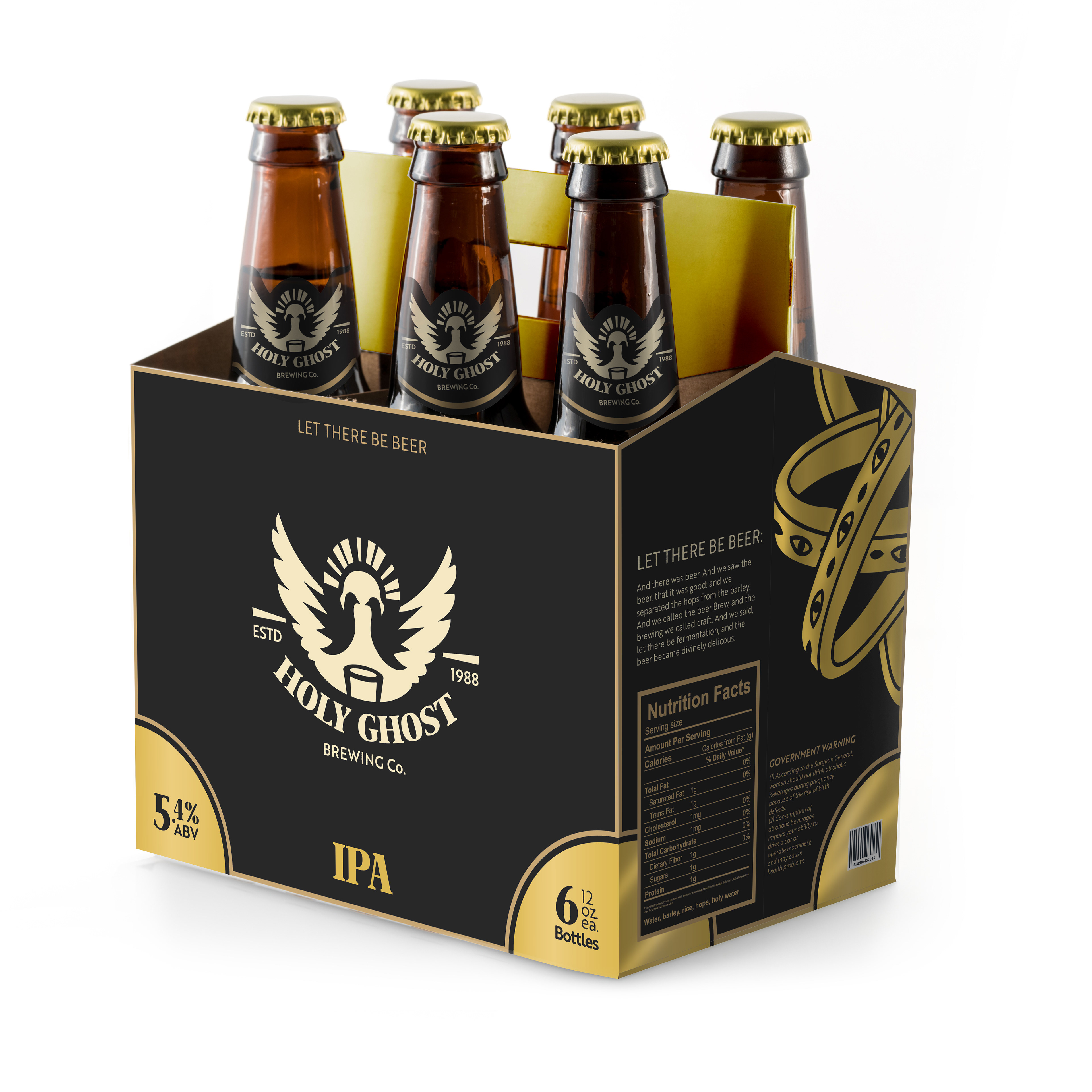

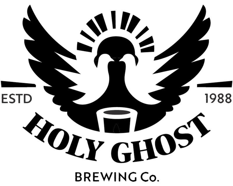

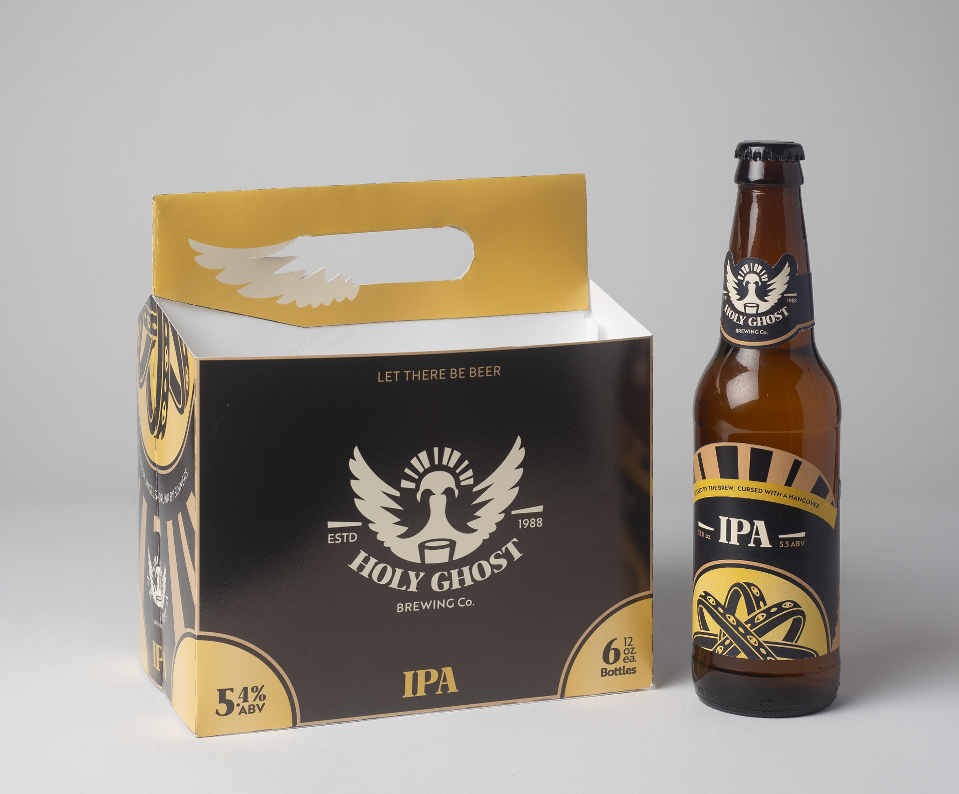
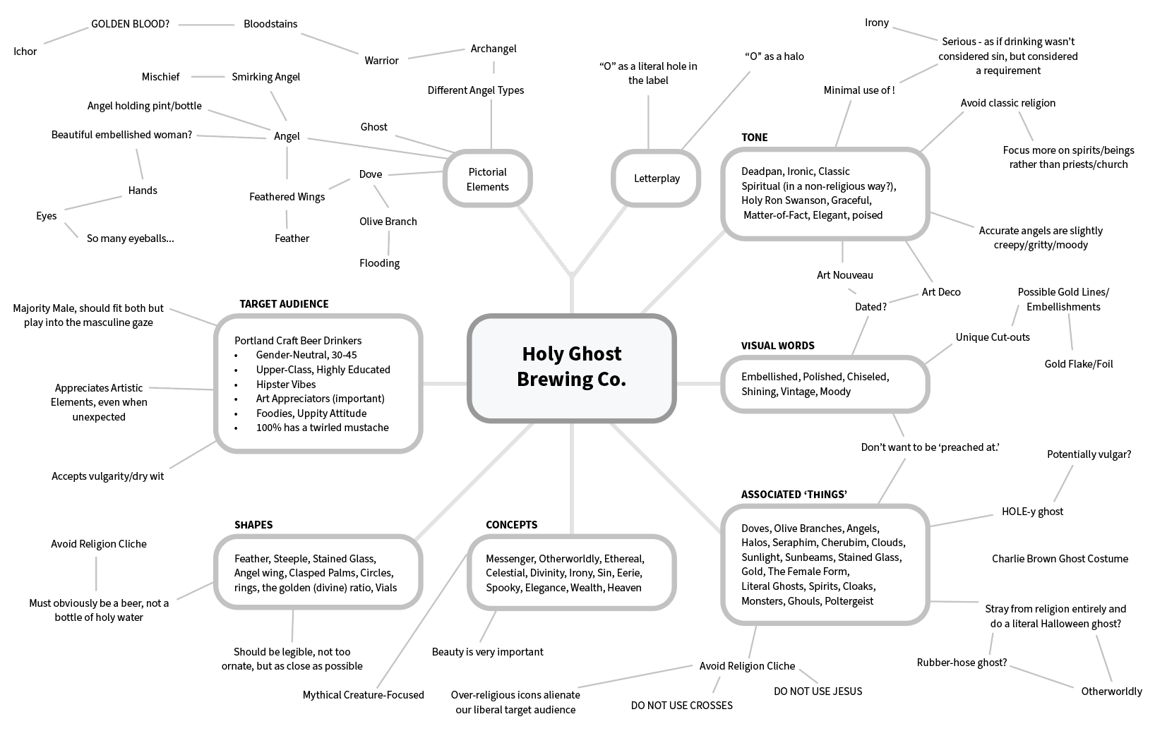
The goal of this assignment was to develop a label and logo for a Portland microbrewery that felt refined and mature, while also incorporating a touch of humor. Embracing religious irony, I designed a dark, gilded aesthetic that combined moody colors with clever, tongue-in-cheek religious references, creating a brand that is both sophisticated and irreverent.
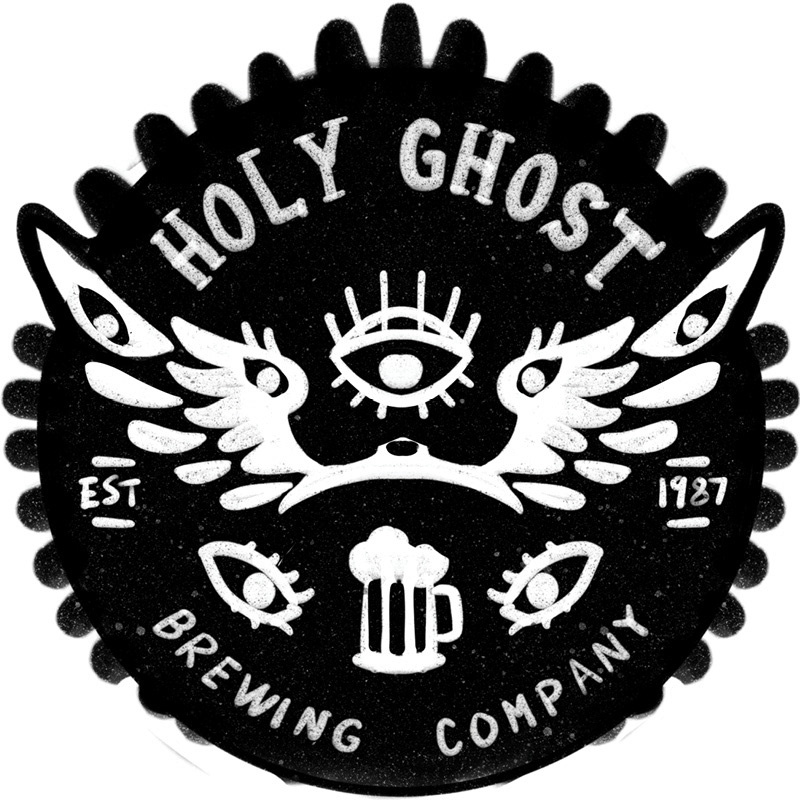
Unselected variants
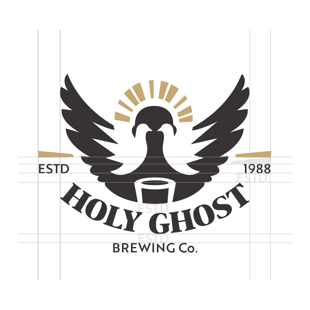
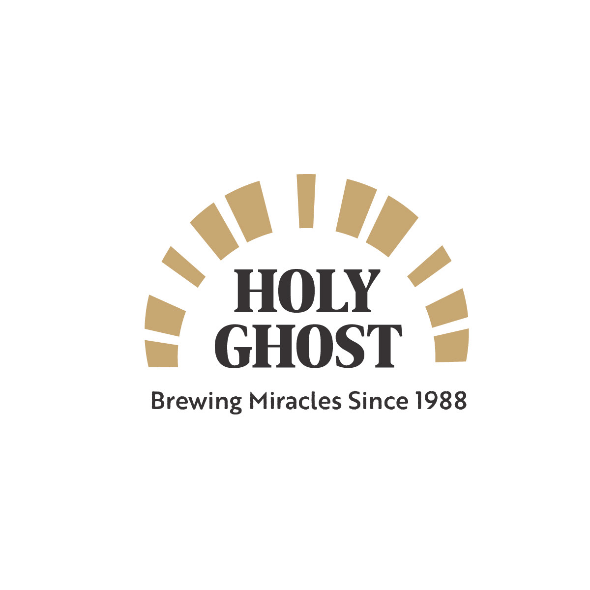
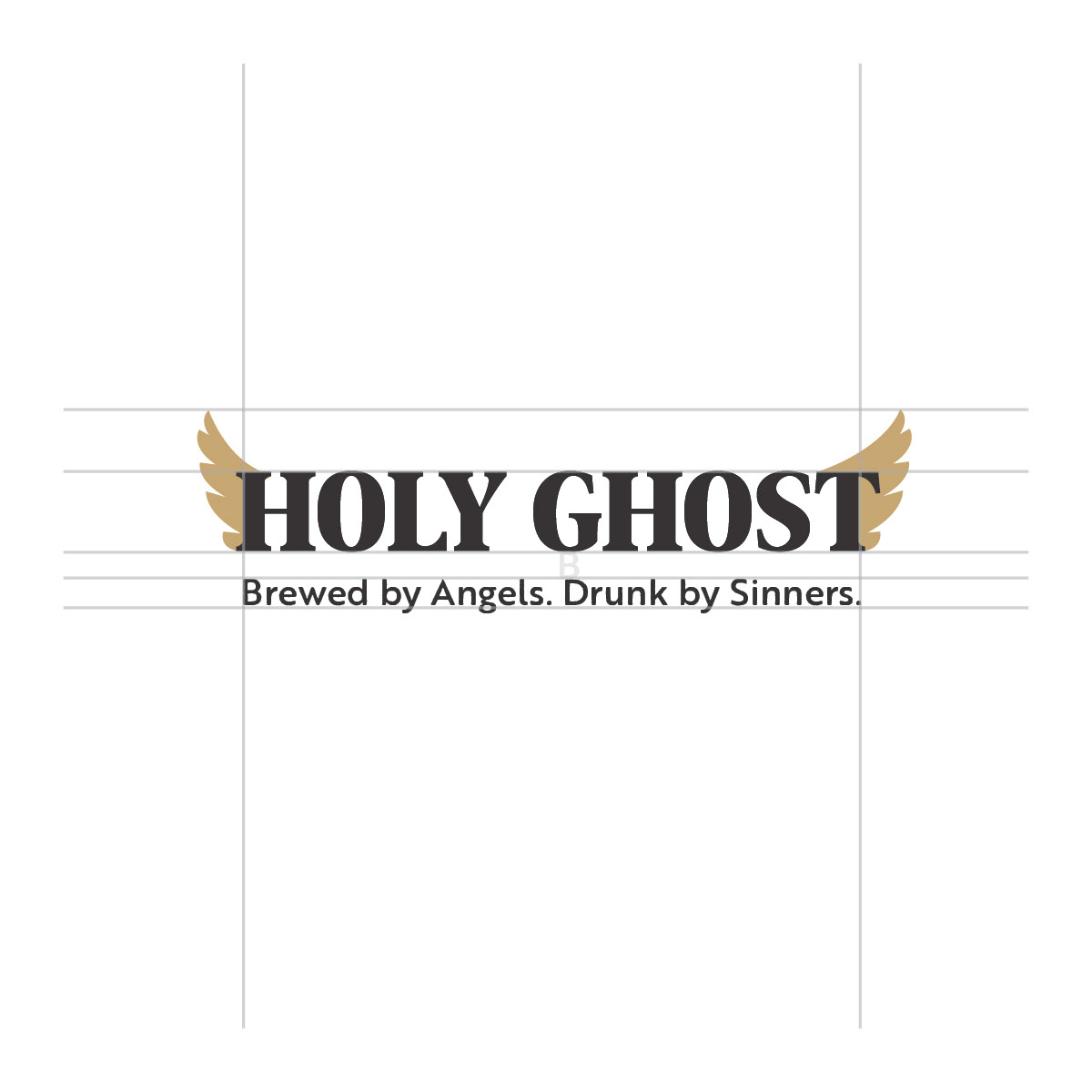
The angelic motifs needed just the right amount of embellishment to convey elegance without compromising scalability. Striking this balance was crucial to maintaining a clean, versatile design. Additionally, the client preferred a more refined approach to humor, steering away from a literal “hole-y ghost” concept in favor of subtle, dry text-based wit.